Hello Kitty – Let’s Go
Score
Sanrio
Design system
Every colour, size and component on the site is defined once. To change the look, change a token in resources/css/app.css (the @theme block); the whole site follows.
The site has a dark and a light mode. It follows the visitor’s device setting until they choose with the sun / moon button in the header (THEME-01). These swatches show the mode you are in: switch to see the other. In light mode night and chalk trade places, and the crayons go a touch deeper.
night
--color-night
Page background
deep
--color-deep
Raised sections
deep-stripe
--color-deep-stripe
Placeholder stripe
chalk
--color-chalk
Main text
mist
--color-mist
Secondary text
line
--color-line
Rules and borders
ink
--color-ink
Dark type on crayons (never flips)
marigold
--color-marigold
Focus ring, highlights
coral
--color-coral
Hello Kitty – Let’s Go
lagoon
--color-lagoon
Crayola
lilac
--color-lilac
Brookhaven
sky
--color-sky
Miko
Marigold and coral struggle on the light background: they are warm, like the cream. These options show the fixes side by side, always in light colours. Ratios are measured contrast against the background; 4.5:1 is the standard for reading text. Pick one of each by ID.
Each crayon does two jobs: big fills (cards, play buttons) and small things that must be read (coloured words, hairlines, outlines). One shade can’t do both on cream, so each has two: the bright original for fills, a deep version for text (the -text tokens). Dark mode is unchanged. Chosen by Paul; the one-shade option is retired.
Two shades: fill and text (chosen, in use)
The fill for cards and play buttons. Each is shown with its deep text shade (from option 1) on the playing title.
Before #f56656
Intruder Alert
Tension Builders
Hello Kitty – Let’s Go
Score · Sanrio
The light-mode coral before LM-SHADE-2: a shade deeper than dark mode’s. Reads a little muddy on cream. Ink on it: 6.1:1 ✓
Original (now) #ff7a6b
Intruder Alert
Tension Builders
Hello Kitty – Let’s Go
Score · Sanrio
Dark mode’s coral, unchanged, and the fill in use since LM-SHADE-2. Brighter and lighter; the closest to the Crayon look. Ink on it: 7.3:1 ✓
Tomato #f2553c
Intruder Alert
Tension Builders
Hello Kitty – Let’s Go
Score · Sanrio
Warmer and punchier: more energy, and further from the cream. Ink on it: 5.4:1 ✓
Watermelon #ff6b81
Intruder Alert
Tension Builders
Hello Kitty – Let’s Go
Score · Sanrio
Cooler and pinker: pops most against warm cream, but changes the crayon’s character. Ink on it: 6.8:1 ✓
Now the playing title takes the show’s colour. Option 2 keeps it in the normal text colour and lets the filled play button say which track is playing: no contrast problem in either mode, and calmer. (Would apply in dark mode too.)
Coloured title (now, in coral’s text shade)
Intruder Alert
Tension Builders
Title contrast: 4.6:1 ✓
Title in the text colour
Intruder Alert
Tension Builders
Title contrast: 15.2:1 ✓
Outline (now)
1.7:1
Marigold sticker, ink type
10.5:1 ✓
The biggest lever: a lighter background lifts every crayon at once. Shown with the original coral (LM-COR-2), two shades (LM-SHADE-2) and the plain title (LM-ROW-2).
Cream (now) #ece8df
Intruder Alert
Tension Builders
Hello Kitty – Let’s Go
Score · Sanrio
The chalk from dark mode’s type. Warm; dulls marigold and coral.
Linen #f2efe8
Intruder Alert
Tension Builders
Hello Kitty – Let’s Go
Score · Sanrio
A step lighter, still warm. Crayons lift a little.
Paper #f7f5f0
Intruder Alert
Tension Builders
Hello Kitty – Let’s Go
Score · Sanrio
Near white with a hint of warmth. Crayons pop most; feels less “chalk”.
The phone is designed first and the desktop adds to it, not the other way round. These rules apply to every page.
Units
Type and spacing are in rem (1rem = 16px by default), so they follow a visitor’s own text-size setting. px is only for hairlines (1px borders). vw appears only inside a clamp(). em is used inside a component so its padding scales with its own text.
Fluid, not stepped
Large type is a clamp(smallest, fluid, largest), so it glides between phone and desktop sizes instead of jumping at a breakpoint. The tables below show the real result at 390px and 1280px.
Touch
Every button, link in a menu and form control is at least 44px tall. Nothing depends on hover.
Layout
Base styles are the phone layout, one column. A breakpoint prefix such as md: adds the wider layout from that width up. Wide sections are re-composed for the phone, not shrunk.
base
Phone, from 320px
sm:
md:
lg:
xl:
Two typefaces, both served from this site: Fraunces (display and reading) and Schibsted Grotesk (interface text). Sizes are measured live from the CSS: phone is a 390px screen, desktop is 1280px, and “this screen” is the window you are looking at now.
text-hero · The name on the homepage. Fluid: grows with the screen.
Wademan
text-page · A page's own title, such as a project's name.
Brookhaven
text-title · Section headings such as Listen and Work.
Section title
text-heading · Table captions, panel headings.
Sub-heading
text-lede · Intros and cue titles.
Lede paragraph for introductions.
text-body · Default text. Never below this on a phone.
Body text for descriptions and long reading.
text-small · Details, labels and notes.
Small text for details, labels and notes.
rounded-field
Form fields
rounded-card
Cards and images
rounded-frame
Large frames
rounded-pill
Buttons and chips
px-gutter · Page side padding
py-section · Space between page sections
max-w-measure · Longest line of reading text
max-w-page · Widest any page's content gets
Motion keeps time with the music: every duration is a note at 90 bpm, so everything that moves shares one tempo. Few things move, and only to show where you are going. A device that asks for reduced motion gets ordinary page loads.
--motion-beat
667ms
One beat. Bigger moves.
--motion-eighth
333ms
An eighth. A page arriving.
--motion-sixteenth
167ms
A sixteenth. A page leaving, small steps.
--ease-settle
cubic-bezier(0.2, 0.7, 0.2, 1)
Arrivals: quick, then a soft landing.
--ease-glide
cubic-bezier(0.65, 0, 0.25, 1)
Travel: eases out and in again.
Quiet page change
The header stays where it is. The old page fades in a sixteenth; the new one settles up into place in an eighth. No white flash between pages.
Card to project
Open a project card on the homepage or Work page: the card grows into the project’s key art and its title flies into place. Go back and it returns to its card.
Changing what’s shown
Choosing a channel on the Studio desk: the old record fades in a sixteenth while the monitor eases to the new height and the new lines settle in, a 32nd apart.
Player opening
Pressing a SoundCloud or Spotify row: its ring turns (a beat a turn) while the player loads out of sight, then the row eases open and the player fades in, already drawn.
The switch is for comparing, and only affects this browser. Transitions play in Chrome, Edge and Safari; other browsers load pages as before.
Every designed page arrives the same way: the title rises out of a mask for a beat, the intro follows an eighth later, then a hairline draws across. The page’s own piece (the passes’ breeze on Live, the gatefold on About) starts after it.
Bass and arrangements for artists, in the room or sent over.
Lines draw in
A section heading’s hairline draws across the first time it comes into view.
Photos open
A large photo (Live’s stage photos, the homepage About photo, the Studio photo, a post’s picture) opens from a slight crop and settles, once.
Images fade in
An image still loading fades in when it arrives, instead of appearing in one go.
A wash while loading
While a photo that fills its column loads, its space shows a soft wash of the colour around it (the show’s crayon on a project, else mist), breathing slowly, in the photo’s own shape; the photo fades in over it.
Light and dark
Pressing the sun / moon button: the new mode spreads out in a circle from it, over a beat.
Everything that already moved (the header and phone menu, the footer credits, the hero strings, the passes, the desk, the gatefold) now takes its timing from the same tempo; each keeps its own curve.
The DWM mark on a stave, drawn in the text colour so it follows light and dark mode. The mark alone in the header; with the name in the footer, for people who don't know DWM yet. Files in assets/logo/, drawn by the logo component.
Header
Footer
The homepage hero sets the site name large. With "Music" added, the original two steps (NAME-01) put "Wademan Music" on one long line. The first two words count as the name; each layout places anything after them differently, and all of them still work for "David Wademan" alone.
Two steps (live now)
David Wademan Music
Staircase
David Wademan Music
Music as a label
David Wademan Music
Name together
David Wademan Music
Chosen by Dave from the options: the floating capsule header with its phone menu, and the end credits footer. Every footer links the Privacy notice and Terms of use.
Clear over the top of the page; once you scroll, it gathers into a blurred capsule floating below the top edge. Reading down, it fades back, nearly see-through; scroll up, point at it or tab to it and it comes back in full.
On a phone, Menu opens it over the whole screen: large links, each on a hairline with its crayon (filled on the page you’re on), then how to get in touch. It wipes down from the top and the links arrive one after another.
The footer as a film’s closing credits: music by, selected credits and bass for, from Dave’s records, then how to reach him, the menu and the legal pages. Each block drifts up into place as it comes into view.
Each lives in template-parts/components/ and is reused wherever it appears. Every example has an ID: quote it when giving feedback, and it links straight to the item.
Playing a cue is always the round control. It is 48px (or 64px) so it is easy to hit with a thumb, and it takes the colour of the show it sits in.
Finer versions: a hairline ring, 40px (56px large), that fills on hover. The tap area is still 44px or more.
Switches between dark and light mode and remembers the choice. A sun in dark mode, a moon in light mode. Choosing what the device would pick anyway goes back to following the device.
Two kinds. One filled call to action per page at most (the main contact action); every other action is a word with an arrow.
Filters over a list. From tablet up, chips (CHIP-04). On a phone, a Filter button that opens a bottom drawer (FILT-01): narrow your window to see it. Both are on the Work page.
10 projects
Cues from recent series. Press play, or click the waveform to jump in.
Other ways to set a heading and its lede. Each is shown with a short lede (a) and a long one (b), since an alignment that suits one line can look ragged at three.
Lede right-aligned to the page edge.
Shows and projects I’ve scored.
Lede right-aligned to the page edge.
When I’m not writing, I’m playing. Live bass for touring acts, and bass and string arrangements in the studio.
Lede under the title, both on the left edge.
Shows and projects I’ve scored.
Lede under the title, both on the left edge.
When I’m not writing, I’m playing. Live bass for touring acts, and bass and string arrangements in the studio.
A hairline runs from the title to the page edge; lede under the title.
Shows and projects I’ve scored.
A hairline runs from the title to the page edge; lede under the title.
When I’m not writing, I’m playing. Live bass for touring acts, and bass and string arrangements in the studio.
Lede as a small caption beside the title, on its baseline.
Shows and projects I’ve scored.
Lede as a small caption beside the title, on its baseline.
When I’m not writing, I’m playing. Live bass for touring acts, and bass and string arrangements in the studio.
Title left, a hairline across, the lede right-aligned at the end of the line. Chosen for the homepage. A lede too long for one line drops below the title (b); wrapping it on the right was rejected.
Shows and projects I’ve scored.
Title left, a hairline across, the lede right-aligned at the end of the line. Chosen for the homepage. A lede too long for one line drops below the title (b); wrapping it on the right was rejected.
When I’m not writing, I’m playing. Live bass for touring acts, and bass and string arrangements in the studio.
Placeholder cue
Hello Kitty – Let’s Go
1:12
Placeholder cue
Crayola
0:48
A SoundCloud or Spotify track on a project page. Nothing from the service loads until it is pressed; then its player takes the row’s place (SoundCloud in the show’s colour).
The same row as a link out, for a record we can’t embed (Bandcamp and others): opens in a new tab.
Cards respond to their own width, not the screen: the title steps down for long words. Use a grid that never lets a card go below 15rem.
Score
Sanrio
Score
LEGO
Original music & score
Crayola
Singles and scores
Roblox
Original music & score
Miko
Score
Narrowest card (15rem)
Score
A medium card (24rem)
Score
A wide card
text-card · text-card-long · text-card-xlong · Directions for the same card, using the same data and tokens. Options are never edited once seen: a change is added as a new option with a new ID, and old ones are retired only when Dave chooses. Each option appears twice: “a” with a short title, “b” with a long one.
Sleeve, night disc rises from the top
Singles and scores
Roblox
Sleeve, night disc rises from the top
Score
Sanrio
Sleeve, night disc slides out of the side
Singles and scores
Roblox
Sleeve, night disc slides out of the side
Score
Sanrio
Sleeve, night disc on the right edge
Singles and scores
Roblox
Sleeve, night disc on the right edge
Score
Sanrio
Sleeve, coloured disc rises from the top
Singles and scores
Roblox
Sleeve, coloured disc rises from the top
Score
Sanrio
Sleeve, coloured disc slides out of the side
Singles and scores
Roblox
Sleeve, coloured disc slides out of the side
Score
Sanrio
Sleeve, coloured disc on the right edge
Singles and scores
Roblox
Sleeve, coloured disc on the right edge
Score
Sanrio
Cue first
Singles and scores
Roblox
Cue first
Score
Sanrio
Sticker
Singles and scores
Roblox
Sticker
Score
Sanrio
A tour laminate for each act Dave has toured with, hanging from a slack cord between pins (the Live page, LIVE-C1; chosen by Dave, 16 Oct 2026; LAM-01, the straight rail, is retired). Crayon fill and ink type, the same in both modes. Each pass draws its own piece of cord, dipping under its pass by a slightly different amount, so any number join into rows that wrap and balance (12 hang as two rows of 6); on a phone, one swipe row. On arrival the cord is strung left to right and each pass drops onto it, so the cord gives and settles; tap or hover lifts a pass, straightens it and its piece springs up. With reduced motion it simply hangs.
The Studio page (STUDIO-A1), shown here with two of Dave's sessions on the desk and the rest in the log. Up to four channels (sessions with "On the desk" switched on); choosing one raises its fader, lights its meter and puts its record on the monitor. Every other session is a row in the session log, which plays through the same monitor. The desk, tape and paper look the same in both modes.
Channel 01 · Bass
All Quarters
Channel 02 · Bass and string arrangements
Moth Eaten Rooms
Channel 03 · Bass
Save the Light
Channel 04 · Bass
Yesterday
Channel 05 · Bass on Andrew Maxwell Morris's tracks
Alt Americana
3 more
The About page (ABOUT-A1): the inside of a record's gatefold sleeve. From 56rem it arrives closed (the cover photo with the name) and swings open on its spine; reload to see it again. A second photo inside on the left, liner notes on paper on the right, with credits set out like an album's personnel. On a phone the halves stack.
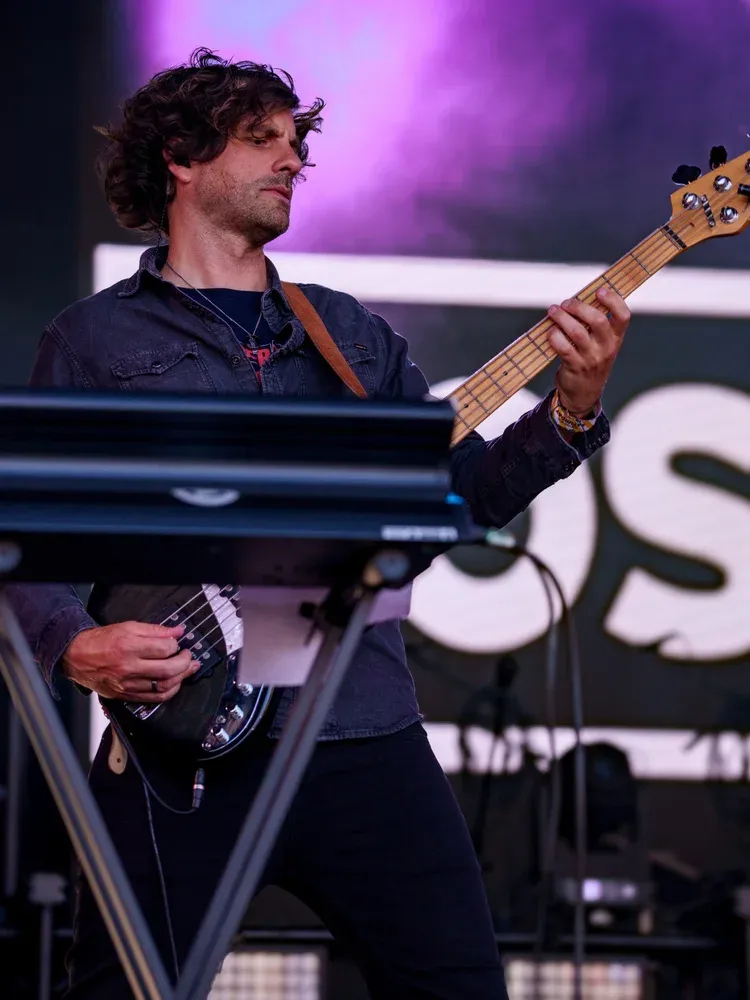
David Wademan Music Composer · Bass
A short sample of the liner notes: two or three paragraphs in Dave's own words sit here.
They run in two columns when the panel is wide enough.
The Contact page (CONTACT-A1): the enquiry as a letter to Dave on paper, the fields as blanks in one sentence. The topic is the site's dropdown drawn as a paper slip (with a mouse; phones use their own picker). Consent and "Send to Dave" share one line. Not connected yet: it says so on submit.
| Title | For | Role | Year |
|---|---|---|---|
| Hello Kitty – Let’s Go | Sanrio | Score | TBC |
| Crayola | Crayola | Original music & score | TBC |
From tablet up, the table with titles linked. On a phone (narrow your window), a stacked list: title in the show’s colour, “client · role” beneath, the year only when it’s known.
Refined fields, two directions. Line: no box, a hairline under serif text. Soft: a filled tile with the label inside. Dropdowns are redrawn: the chevron is set in from the edge and the open list is built from our tokens. On touch screens the phone’s own picker is used instead. A consent checkbox is included for each (a GDPR acceptance).
· 0:00 on SoundCloud